Experimental typography centers on typographic research, play, and experimentation. I created different small projects about this theme and focus on scale, site, and message, constructing language out of traditional and non-traditional materials, both on and off the page.
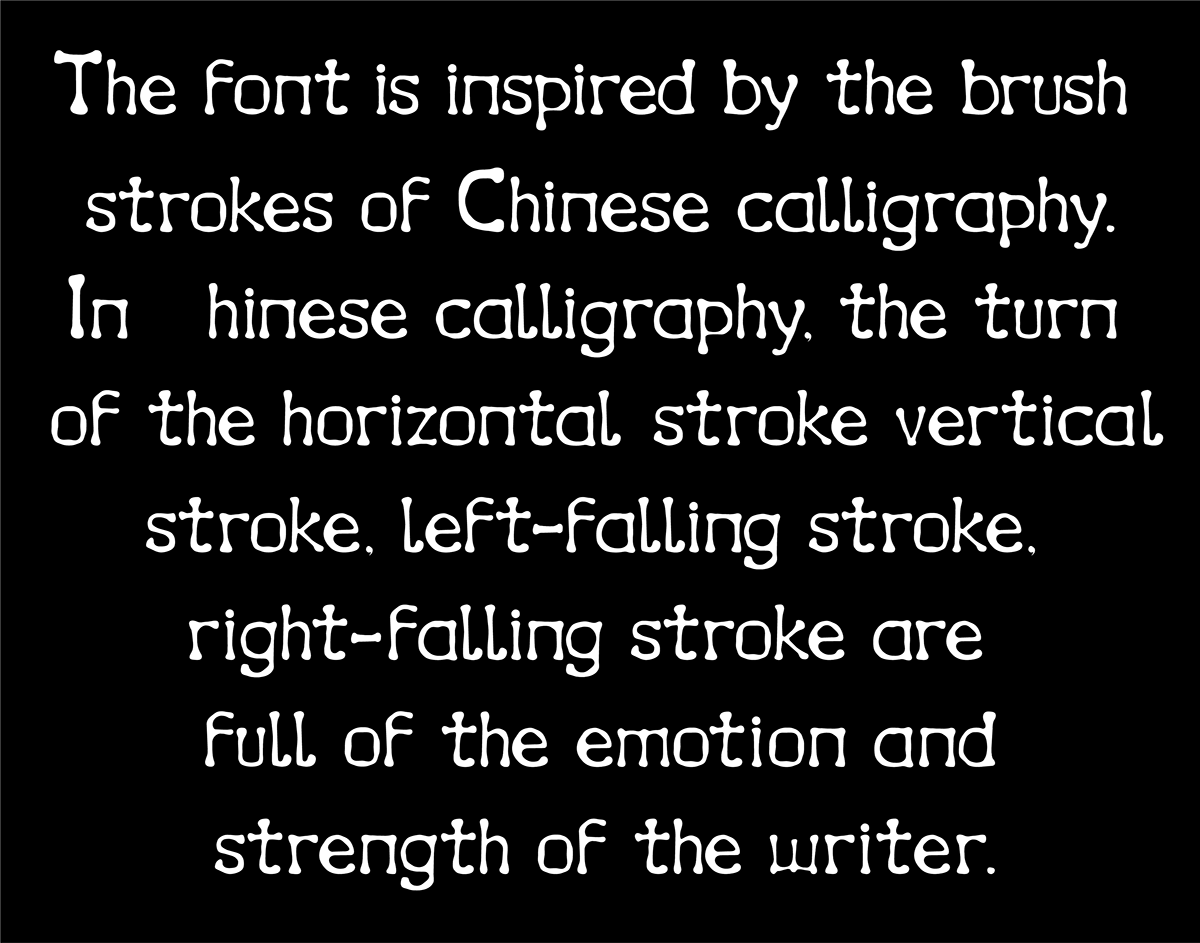
This typeface is inspired by the brush strokes of Chinese calligraphy. In Chinese calligraphy, the turn of the horizontal stroke, vertical stroke, left-falling stroke, right-falling stroke are full of the emotion and strength of the writer. When we were children learning to write, we would always try to imitate the power of the transitions between strokes, but it was an attempt with uncertainty. What if we apply the same attempt to brush strokes that children make when learning Chinese strokes to English characters? That's where I got the idea for this typeface. The font has a heavier point at each turn and straight lines with some bending, like the unstable force of a child's hand when practicing writing.
This typeface is inspired by the brush strokes of Chinese calligraphy. In Chinese calligraphy, the turn of the horizontal stroke, vertical stroke, left-falling stroke, right-falling stroke are full of the emotion and strength of the writer. When we were children learning to write, we would always try to imitate the power of the transitions between strokes, but it was an attempt with uncertainty. What if we apply the same attempt to brush strokes that children make when learning Chinese strokes to English characters? That's where I got the idea for this typeface. The font has a heavier point at each turn and straight lines with some bending, like the unstable force of a child's hand when practicing writing.


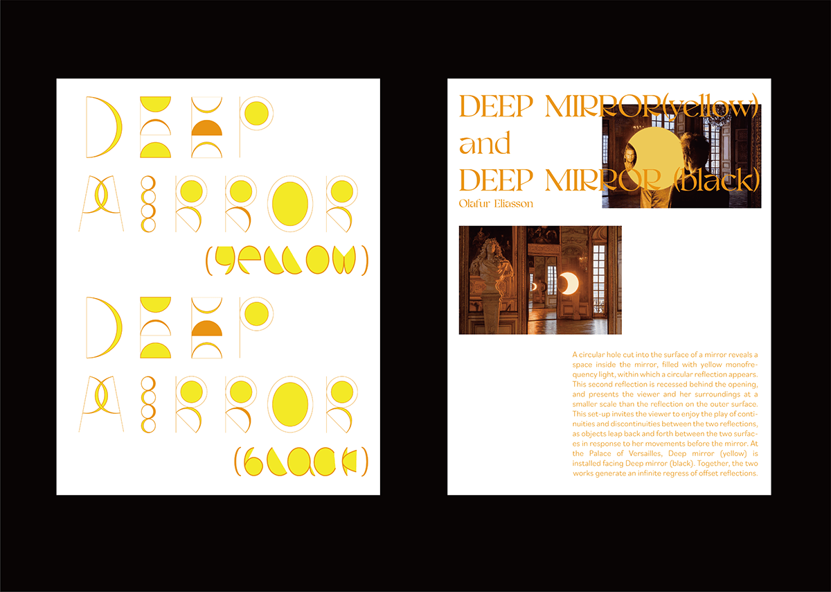
The typography of each exhibition will fit the theme of the exhibition so that the viewer can have a pre-expectation and understanding of the theme of the exhibition, which is part of the visual design of the whole exhibition. This typography is based on Eliasson's exhibition Deep mirror (yellow), 2016 and Deep mirror (black), 2016. I combined several key features of the exhibition, such as mirror, reflection, and lunar eclipse, and used a large number of crescent and circular shapes as typeface strokes to show the offsets produced by the mirror reflection in the exhibition.


Clips are common stationery items. I twist the clip to create a mark-making system for drawing letters based on repeating component pieces. Since the paperclip is a physical object, I created it in the form of a 3D font to better present this visual effect. This representation helps to visualize how each paperclip is combined to form different letters.


The picture on the right is an actual picture of me wrap- ping the fleece around the L letter of the paperclip design. On the left is an image of how the fuzzy texture looked when I applied it to a font I had designed in my previous project using 3d software.


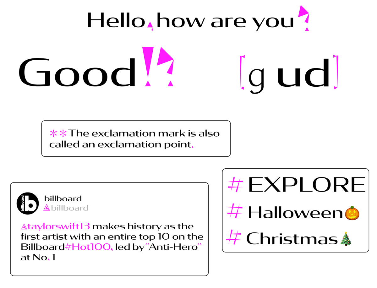
I have designed two font designs for punctuation marks. The one is designed by using the shape of a heart according to the shape of different punctuation marks. Another one is a punctuation system using the shape of a triangle.